SMART BANK
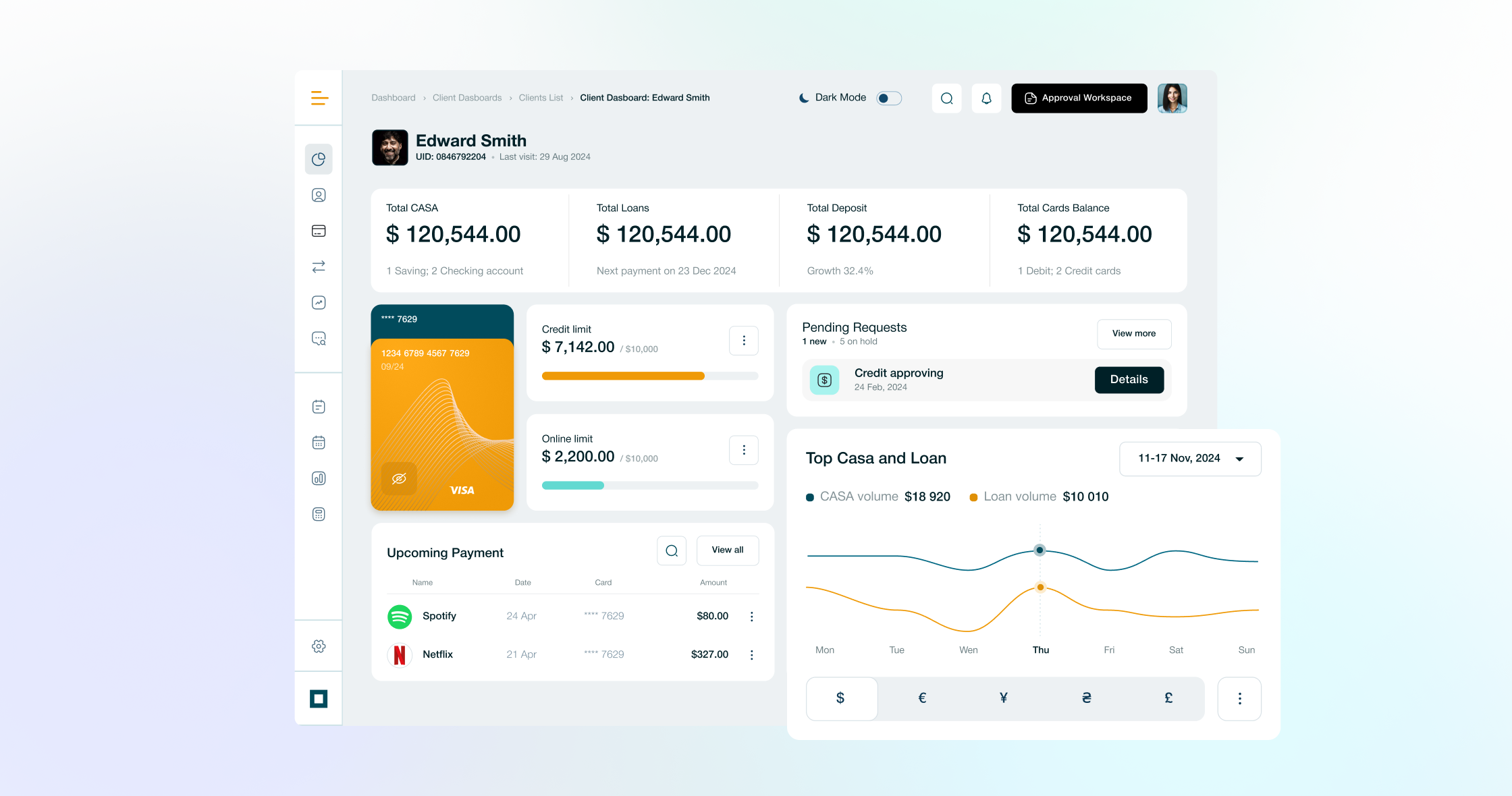
Customer mobile app &employee dashboard.

About
I designed the pre-sale concept for Smart Bank, a new digital bank: a mobile app that brings all financial needs into one place, and a matching dashboard for bank employees. As part of a team of three designers and a PM, I covered research, UX, UI and 3D illustration over two months, with a bold, recognisable visual style that stays accessible.
Context
Smart Bank was a new product with no existing app to build on. The work was a pre-sale concept: a first prototype meant to show the client what a modern digital bank could look and feel like, for customers and for the people who run it. The brand name was changed under NDA.


Users
Two groups, two products. The mobile app is built for young customers, who expect a bold, modern look and quick access to everyday money tasks. The dashboard is built for bank employees, who work in it every day and need it to be clear, fast and comfortable to use for long periods.
My role
Designer in a team of three designers and a PM. I worked on the research, UX and UI, and created the 3D illustrations.
Challenge
Create a mobile app that lets customers use the bank’s services without friction, built on a recognisable visual style. Then deliver a corporate dashboard that makes employees’ work easier, following the same branding. Bold visuals are easy to get wrong in banking, where people also expect trust and clarity.
Goals
- A visually appealing app and dashboard that stand out for both customers and employees.
- Equal weight on usability and aesthetics.
- Success criteria for a live product: app downloads and growth in transaction volume, as signs of adoption and business impact.

Research
I analysed competing banking products and drew three insights from them:
- Customers want the main operations within one or two taps, without searching through menus.
- Banking apps tend to look alike and dry, so a recognisable visual style can be a real advantage.
- Employees need a dashboard that shows the main picture quickly and does not overload them with data.
Key decisions
-
Bold, but trusted.
The hardest balance was combining a bright, recognisable style with the trust people expect from a bank. The visual language stays expressive, with 3D illustrations, while layouts and flows stay clear and predictable.
-
Main operations first.
The app brings all financial needs into one place, and the everyday actions (accounts, cards, transfers) are always close at hand.
-
A dashboard built for daily work.
The employee dashboard shares the app’s brand but is designed for people who use it all day, so it stays visually connected to the app without sacrificing usability.
-
Light and dark themes, built for daily use.
Because people open a banking app many times a day, I treated themes as a real accessibility feature, with separate colour sets, design tokens and contrast testing.

One brand, two products
The app and the dashboard share a set of components, but each speaks its own visual language. The same building blocks can change their look, so customers get an expressive interface and employees get a calmer one, while both clearly belong to the same bank. This keeps the product consistent and makes the system easier to extend.
Solution
The customer app covers the account overview, the transfer flow and the cards screen, in both light and dark themes. The employee dashboard offers a full view and an analytics detail view. 3D illustrations carry the bold brand across both products, and a shared UI Kit holds the components and tokens together.
Outcome
I delivered the first prototype of the full concept: the customer app, the employee dashboard, the UI Kit and the light and dark themes, ready to present to the client in the pre-sale stage. The project is under NDA, the brand name is changed, and final screens were not shared.
“An exceptionally resilient teammate — she stayed calm through uncertainty, adapted fast, and brought a demanding creative idea to life within days.”
 Victor FedyukCo-owner & Art Director at Qubstudio


What I took away
A banking interface can be attractive and still accessible. The bold look gets attention, but contrast, clear flows and themes built for daily use are what make people keep using it.